How and why can icons improve a website?
You have no idea how often you come across icons in everyday life. You can find them in any interface, on road signs, keyboards, and so on. Therefore, it is very important to understand how and why icons can improve the site and not only. Today I will show you some examples and explain how to use icons effectively on websites.
Icons support the content
It's usually easy for us to tell a good site from a bad one.
However, it is difficult for us to say why one is better and the other is worse. It often happens that the devil is in the details.
When we consider website content, it all comes down to readability.
Readability is simply a quick understanding of the main subsections and the ease with which any user can process further information.
How can you easily achieve readability and improve your website?
With the help of the right icons that can help us in several ways:
- They will gather all the content into one easy-to-read tablet.
- They will grab the attention of users.
- They will increase the overall readability of your content.
Now let's take a closer look at each point.
1. Icons collect all the text into a single thought
With the help of pictograms, you can quickly summarize what the whole text is about.
Sometimes even a few icons and small graphics can quickly convey most of the information contained in the content, saving the user from having to read additional and unnecessary text.
Remember that icons should be approached the same way as metaphors.
In my opinion one of the most important things about icons is that we humans learn visually and sometimes one image is enough to convey "a thousand words".
For example:
- - everyone will understand that this icon means a shopping cart in an online store
- - we know that after clicking on this icon we can see a calendar or select a date
- - Most of us know that an icon stands for some form of contact, usually an email
If you feel like a small icon doesn't convey enough information, you can optionally use small images or screenshots.
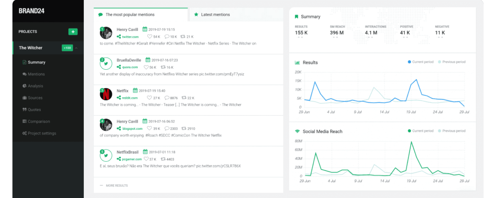
A good example is the description of the features of the Brand24 platform:
2. Icons grab users' attention
As I said earlier, one photo can be worth "a thousand words". The same applies to icons.
Nowadays, websites without icons and graphics can seem very boring and ugly to us.
Imagine a simple newspaper with only text - no pictures or banners. Boring.
In addition to catchy headlines, our attention is drawn to colorful pictures, graphics or icons.
That's why you always look first at an article that stands out with a beautiful graphic design, even if the content is not interesting to you (because you don't know it yet).
Remember that it is very important to match and integrate the selected icons and graphics with the given graphic design and overall design so that everything fits together and forms a unity.
It's not enough to choose a few free icons and just place them on your website.
Icons will not only grab the attention of users, but at the same time help create the structure of the site and separate different functions or services.
Each icon has its own function, and they also create a neat page structure that can organize the site.
Sometimes online stores use the same or similar icons in different places.
For example, we can use two different shopping cart icons for an online store in different places in the store. Both icons are associated with the purchase of certain products, but may have different functions.
Their functions are made clear by appropriate placement or by adding text next to or below the icon.
Here we are already entering the world of UX/UI and I can't help but mention the proximity principle.
The Proximity Principle states that related elements must be grouped close together in order for them to form an organized layout. Unrelated elements should be placed further apart to emphasize the lack of connection between them.
So, if the cart icon is located next to the prices or the image of the product, then we know that these elements form a single whole and interact with each other, so, for example, by clicking on the cart next to a certain product, we add this particular product and not another.
If the cart icon is on the menu side of any products, then we know that it represents a preview of the entire cart.
If you ever use the proximity principle in your online store, make sure the icons are the same size and margins.
Remember not to post them casually as customers will think your store is sloppy and won't want to make a purchase.
Later in this article, I will go into detail about the rules for combining text and icons.
3. Icons increase the overall readability of your content
Listing important content can increase the readability of your articles. However, the standard "points" can already be quite boring for us.
Instead of a standard listing, use eye-catching icons to draw attention to a specific item or block of content.
The listed sub-points not only look "clean", but also create associations of correctness for us.
There are very few icons that can exist on their own
It can be very difficult for inexperienced Internet users to understand and distinguish between different icons.
I know from experience that older people cannot show me the differences between the icons and even have a hard time understanding what they express.
What should have been so simple and intuitive is actually not so easy to understand, and for some it's just a nightmare.
For me, as a web developer, all the icons are obvious, but if you have an online store, then, as you will see, many of your customers will not understand why the Google map tag has such a shape, plus it is placed there, where is your physical address.
A simple solution to this problem can be a combination of icon and text.
This way users can read the text and remember what the icon means.
If you are developing, for example, a web application, you can implement a feature for already experienced users to show only icons without text.
It is worth remembering that the aforementioned principle of proximity works equally with icons and text.
How and why icons can improve a website - summary
Icons play an important role in website design. While they may be very small and not very visible, they are essential to us today and can greatly improve a website.
Icons can be a great way to highlight and make the body of text visible.
In addition, they are an excellent "attention grabber" in the era of the so-called content scanning.
When using pictograms in your own design, make sure they express relevant metaphors that users can easily understand. Remember, however, to describe each icon to avoid misunderstandings.