


Tables on websites - 8 tips for their design
I don't know if you know, but earlier tables on websites were used not only for visual presentation of data, but also as ... a framework for building a website layout. Fortunately, the last goal has long since disappeared, and I am convinced that it will not return to us. The original and only purpose of a table is very simple: to present data in a clear, structured way.
Even though the design trends are moving forward and the table seems dated to many, nothing could be further from the truth. In fact, this element is a little "clumsy", but it still represents a great opportunity to convey the necessary information to users in a convenient way.
Why?
Tables on websites make all data extremely clear and easy to organize. They can be used not only to present a small amount of information, but also more. They are great for comparing, for example, different types of offers, subscription plans, and other services.
It has long been said that content should be easy to crawl. The idea is that the Internet user should be able to get to the content of the article fairly quickly just by looking back and forth. Tables make this as much as possible.
So check out what to think about when designing tables on websites. Here are 8 tips that you might find helpful.
What should you keep in mind when creating tables on websites?
1. Use different colors
Let's start with an example. Look at the screenshot below:
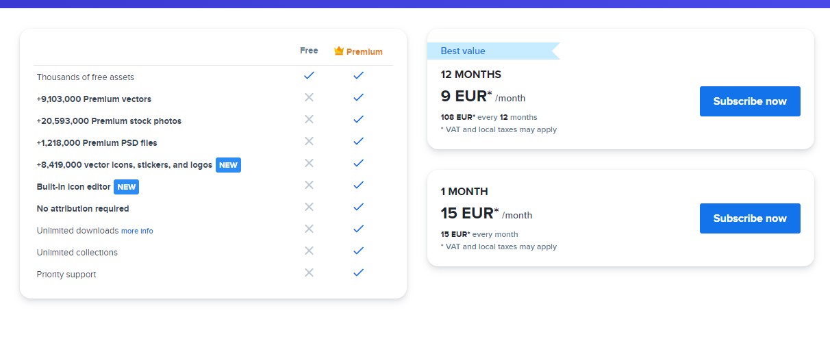
I must say that the presented table is visually pleasing.
It is not exaggerated by the amount of information, and the overall design leaves a good impression. The information is completely readable.
Colors play an important role here, highlighting certain types of data.
Their use makes it easy to distinguish more important information from less important.
2. Support yourself with icons
Icons are extremely widely used on many websites.
This is not surprising, since they are able to convey many words with just one image.
Our brain makes associations with shapes and other visual elements much faster than with text, which we have to read carefully to understand its meaning.
Therefore, we can say that icons are a kind of mental label.
If the table you plan to create will contain data that can be easily replaced with icons, or if icons would be a nifty addition to it, use them.
3. Highlight the option
Again, let's use an example:
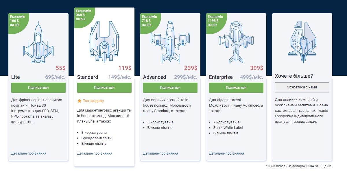
The above screenshot is a kind of price list. Here are three types of accounts that can be created using the service.
The middle version is highlighted for a reason - both in color and size.
This is just a suggested choice. Something recommended by the creators of the service in case we can't decide on something specific.
Sometimes it happens that we just can't make a decision. Therefore, we like to use someone else's opinion. Such a procedure allows us to bet on something - at least in theory - optimal.
If you are interested in the subject of price lists, I have something for you. Bartlomey Kilyan once published an article on our blog about designing price lists on websites. Be sure to read this article full of valuable information and real life examples.
4. Don't combine, don't make it weird.
A table is a very simple, almost template form of data presentation.
It boils down to a grid - X by X cells.
It's most readable in its original, standard form - the one we're all used to.
This is what standards are used for, so that as many users as possible can easily move between them. Therefore, stick to them, since any deviation from generally accepted standards may raise questions.
5. Don't overdo it with the amount of information
Look at the screenshot below:
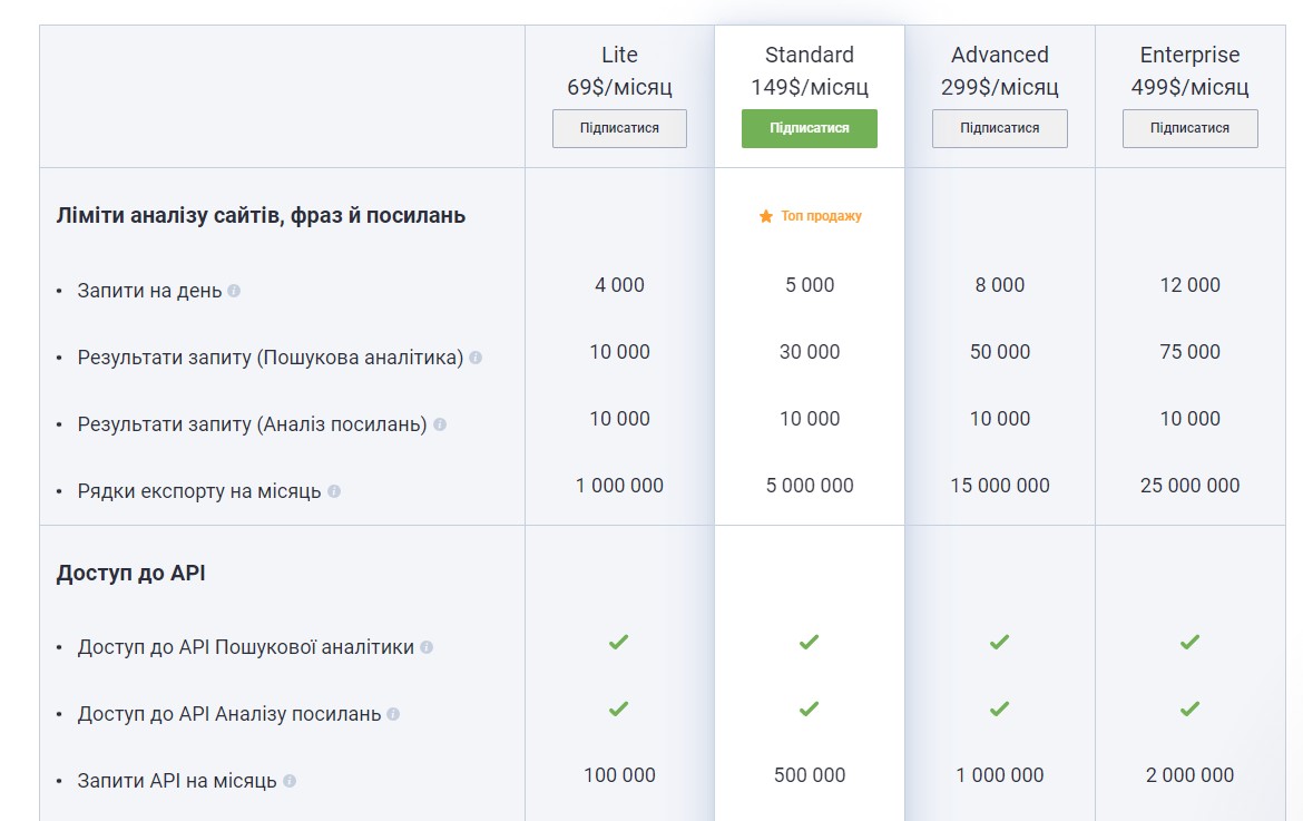
Ask yourself - is this table readable?
It could be improved in at least a few ways:
- quite a few features common to all packages - so you could get rid of the duplicate lines and mention somewhere that all these features can be found in each of the options
- row background color is different for even and odd rows (this may be hard to see, but it really is), but with so many columns one could distinguish colors between them more clearly
- just too a lot of information is presented at the same time
The last point is especially important. Our psyche already works in this way - when we have too many choices, we often feel uncomfortable and end up not making any decision (other than the one that leads to leaving this site).
6. Consider Sorting
Tables on websites can be maximally sorted.
Usually, headings are made clickable for this - the first click, for example, sorts the information in this column in ascending order, the second click - in descending order, and so on.
Of course, this only makes sense if, on the one hand, the table is large enough, and on the other hand, it contains data that makes sense to sort (number type).
7. Consider a search engine
A search engine that links to the data contained in the table can also be a good option.
Again, this only makes sense if the table is large and contains a lot of data.
However, it should also be taken into account that now we are quite comfortable using search engines built into web browsers, so creating a search engine specifically for a particular table should be well motivated.
8.Use appropriate cell spacing
Below is an example of a table that I think is extremely aesthetically pleasing:
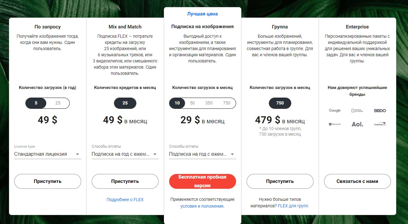
It strikes the perfect balance between enough data and enough so-called "white space" , i.e. spaces between individual elements.
Such a "respite" is very useful for several reasons.
First of all, the right balance of white space helps to visually separate the elements from each other. So they are grouped in a certain way.
Secondly, sufficiently large spaces have a positive effect on the level of data readability. That is why we use tables to enable users to easily read relevant information. They cannot be hindered - they must be supported in this.
Thirdly, flat design is now in vogue, that is, the use of fewer elements, the rejection of complex shapes and shadows, and the use of the aforementioned free space. This design is simply pleasing to the eye.
What about responsiveness?
Tables on mobile devices can cause quite a few problems. They need to be well-styled for narrow screen devices as well, as all the information they contain needs to look great literally everywhere.
For a more detailed explanation of how to achieve, among other things, the above effects (along with live examples and ready-to-use HTML and CSS code), see the excellent tutorial on the CSS Tricks site. The above animation is taken from there.
Do tables on websites stay up to date?
Of course, yes.
Even though time is moving forward, tables on websites are doing well and there is no sign that this will change in the near future.
All because it is a very simple and understandable form of presenting information.
Passing our eyes over the rows and columns, we can easily study the data we are interested in.
I hope you find the above information useful.