How to make a price list on the site
The price list itself is often the key point where the user makes the choice between whether or not to use your service. Therefore, it's worth turning the heat up to increase the likelihood of a positive audience reaction to your content, and introducing multiple flavors to effectively present the price list on the page and attract customers. Be sure to check out our tips on how to arrange a price list on the page.
How to arrange a price list on the site? - 8 tips
1. Comparison, the basis for evaluation
No matter what you are going to buy, you are comparing without even realizing it sometimes. Rarely do we know enough about the purchase in advance to take the finished product off the shelf and understand what we want.
In the vast majority of cases, we make a choice between two or three products, considering what one has and what the other does not. Thus, we are looking for a middle ground and an optimal choice.
The price list is the same task, which is best presented in the form of a table or plans so that you can conveniently highlight the differences between the various options. In the case of "dry text" it's really hard to achieve an effect where you effectively show the differences.
Therefore, the basis is a tabular comparative form.
2. Exposure of what you offer
In a price list form, it is helpful to list all the components and features of a particular plan so that the potential client knows what is included in the price. It is also supposed to show the differences between the individual plans, on the basis of which the decision is made to choose one of the options.
The most common and generally very effective way to show this is with "birds", which show what is included and what is not included in the plan.
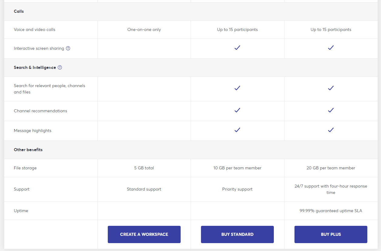
Here you can see the differences between the plans with the naked eye. This makes it easier to make a decision and adapt the plan to your own needs.
For many options, it's a very interesting idea to make the top header of the tables static to show the most important information (price and CTA button). See what it looks like live.
3. Limit the choice according to the paradox of choice
The more choices, the more difficult it is to make a decision and the easier it is to make a mistake. Therefore, try to approach the number of options offered reasonably. Most often on the site you will find price lists divided into 3 or 5 plans. More plans can be very overwhelming and, above all, difficult to read.
If the differences in the individual price list plans are small, then limiting the number of plans may be a good direction.
Here is an example of a price list presentation on a page with a large number of plans. It's rather unreadable due to the large compression of the elements.
4. Use your free plan safely
Your price list may include a free plan. However, why should we handle it safely? Because it works both ways. Good and bad.
The bad thing is that if you show it along with paid versions, the user will definitely compare whether the paid option is beneficial for him. Thus, he may get the impression that he does not need a few additional features and will switch to the free version.
On the other hand, kindness works in reverse. This shows that the free version pales in comparison to the paid version, so that the recipient gets the impression that it is not even worth messing with.
Therefore, you need to distribute the features well between the free and paid plan.
There is one more piece of advice. You can completely avoid using the free plan on the site's price list, and instead activate your default account as a free trial, i.e. a version with a time limit. Here's how it's done, for example, with Dropbox - look at the second image attached to this post. Each plan is paid, but the CTA button directs you to a trial: "Try it for free."
5. Offer a choice
Please note that in the stationery store, the seller recommends and offers us something. This also applies to online stores, where there are sections entitled, for example, as a rule, "Bestsellers", i.e. the most frequently purchased items.
Therefore, make sure that the price list presented on the site suggests a plan and its choice. You can use different words to emphasize this - for example, recommended, most popular, buyers' choice, most popular, etc.
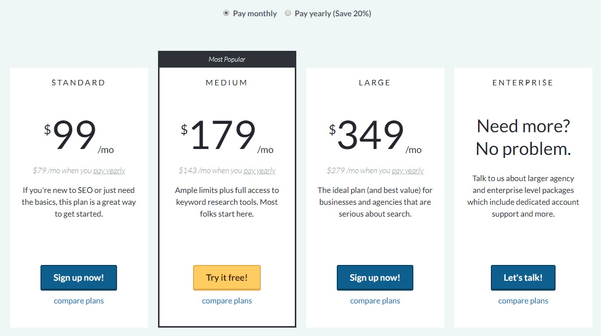
Here the recommended choice is very well accentuated. The user actually immediately sees this option, and it is on it that he focuses his eyes from the very beginning.
6. Reorder the plans
I've looked at a lot of price lists on websites, but I haven't come across a single one that was reversed.
All plans start from the cheapest to the most expensive. So maybe the smart choice would be to break that convention?
Mainly because there is a concept in psychology that the first information we receive influences our decision. It can be illustrated like this: the first impression is the last, right?
So perhaps showing off the most expensive plan at the start would be more appealing due to the many options on offer.
If you are wondering how to arrange a price list on the site, perhaps you should approach this issue from the opposite side than most?
7. Name Plans
Naming plans have the value of being able to identify with something. This, in turn, leads to a better interaction with him and increases the chances of success, that is, sales.
You can get creative with this, but showing who the plan is for is just as helpful. What target group does it cover and who is the right person for it.
Here it is shown in such a way that we have named plans that suggest for what purposes to choose one or another package, as well as a broader description just below the package name as lightening.
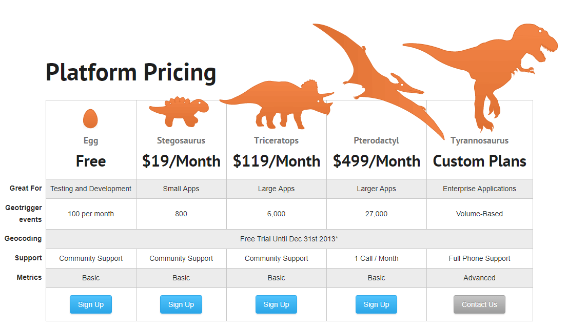
Here, on the other hand, is a more creative way, where we have a visual representation of which plan brings which benefit. The free one is just a dinosaur egg, and the richest one is obviously a tyrannosaurus rex. Tricky approach.
8. Encourage a longer offer
Pricing can also be based on time, i.e. on a subscription to a service for a certain period. It is worth encouraging customers to sign up for a longer term, as it is more cost effective for you.
To effectively stimulate this, of course, it is worth using a promotion when, for example, you can save more with an annual subscription than with a monthly one.
An effective price list on the site shows first only annual prices, and then monthly. In addition, it would be nice to present the amount or percentage of cost that can be saved.
How to make a price list on the site? - a summary of the text
I hope that with the help of these eight tips and examples, I gave you an idea of how to arrange a price list on the site so that recipients are happy to use the service.
Small changes and adjustments are enough to please more customers.
Good luck implementing an effective price list on your website!