How to influence CTR with images?
It can be said that a picture expresses more than a thousand words. While this may sound somewhat lofty, it is also quite true.
An appropriate icon, a fantastic photo, a multi-layered product shot - all this can convince us to take a chance.
This text is about how to influence CTR with images - in other words, you can increase the CTR of various elements by choosing the right graphics to accompany them.
So check out these 9 tips to help you properly set up the images on your site so that they are useful to your visitors.
How to influence CTR with images? - 9 Tips
1. Destination
In my article on how to optimize your landing page, I mentioned that the placement of various elements matters. With images, the situation is different.

The above example is very revealing. Melissa Griffin posted a photo of herself on her website. Note that her gaze is turned to the right.
This happens for a reason. Your gaze should follow her path and "land" on the right side, where there is a large button to use her material library.
This is the goal of her site, so this treatment increases the likelihood that you will achieve it.
As you can see, the placement of a photo (and its type) can make a huge difference. So add them wisely.
2. Pay attention to the choice of colors
A text about the importance of colors on the Internet (by the way, one of the most popular on our site, despite the fact that several years have passed) makes it clear that on the Internet certain colors are not appear out of nowhere.

Keep this in mind not only when choosing colors for your site, but also in the context of inserting images on it.
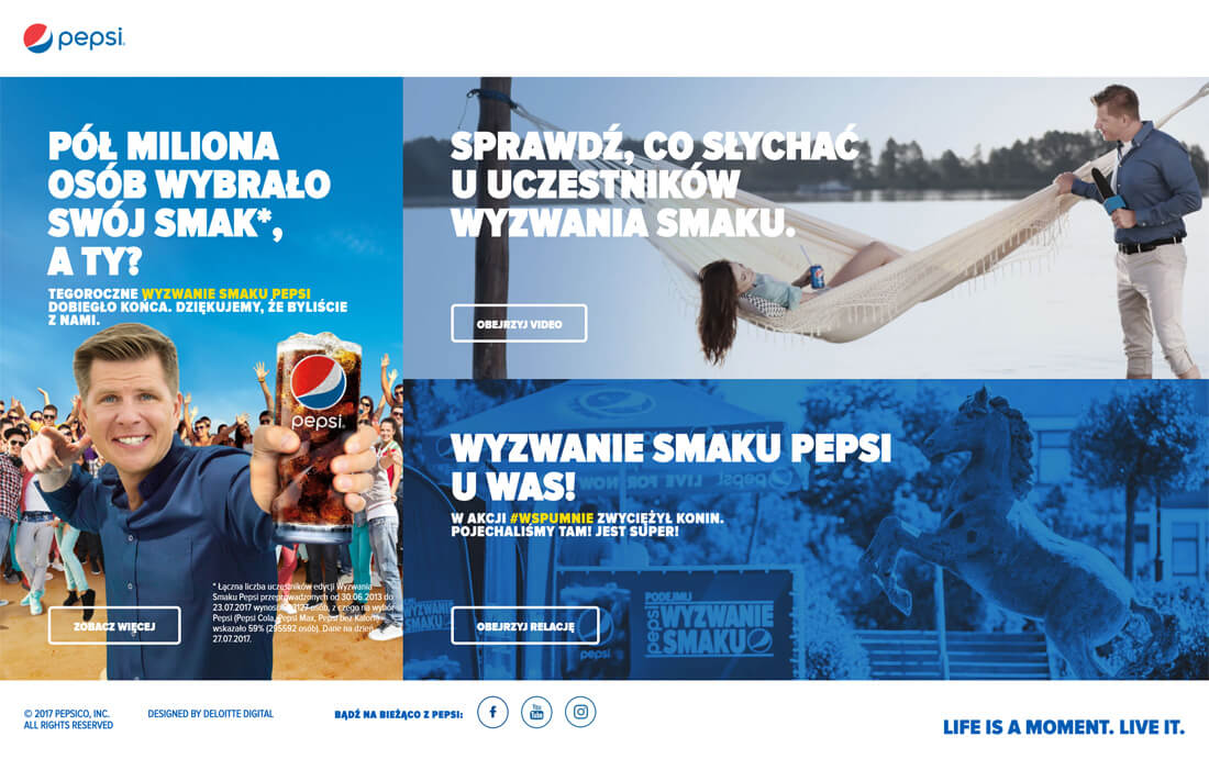
You can see how all the images were selected here.
The one on the left is almost half filled with blue sky, which is the base color for the Pepsi brand. The photo in the upper right corner, in contrast, has many shades of blue. And in the lower right corner, a blue filter has been applied to the photo.
The whole composition is very solid and pleasing to the eye. Obviously, the main color is blue - which is very good, since this is the color we most associate with the aforementioned brand.
Please note that everything here has a specific purpose and does not happen by chance. Try to manipulate the colors on your site in such a way that the whole composition is just harmonious and complete.
3. Consider using a so-called mascot
E-commerce trends in 2017 heavily emphasized the presence of a so-called brand hero, or mascot.
The first thing that comes to mind in this context is Dr Tusz from Bialystok. This company skillfully uses Rudy's mascot. This is a character whose presence is very strongly accentuated, at least in social networks.
This is a very interesting way to associate the whole company with this character. If someone stumbles upon a photo on social media of, for example, this mascot, they might think, "Yeah, that's that doctor with green glasses and red hair - of course he works with ink." It's just a quick association.
In addition, the introduction of a fun, colorful and "cute" character makes the company itself friendly in the eyes of potential customers from the very beginning, even before they use its services.
Remember that having a brand hero can also have a fantastic impact on the look and feel of a website. Nothing prevents mascot images from appearing frequently on this site, such as pointing to important elements for users through various gestures (for example, a character showing a button to be pressed at a certain moment).
4. Remember your emotions
If it was decided to insert a photo on a certain web page, then the author of this processing had a specific goal. Most likely, he wanted to strengthen the message, that is, to evoke some kind of emotion.
The example above is perfect in the context of how to influence CTR with images. The time this screenshot was taken was November. The autumn and winter months in Poland are the time when we are looking for an opportunity to travel to exotic countries to completely change the climate. Presenting such a beautiful view visualizes our dreams. We think to ourselves, "Oh, that's right, that's more or less the look I'm looking for."
There is just a desire to break out of the gray landscape of the November dive - in other words, the aforementioned emotions.
5. Use high quality images
The meaning is even obvious.
If you are presenting any images anywhere, make sure they are simply beautiful:
- they must have the correct extension (for example, PNG is good for flat-style graphics, and JPG is optimal for photos )
- they must be of the correct resolution (i.e. not too big, as it will take up extra space, but not too small so that the image is the right size)
- it is also important to use compression, but not so much so that image quality suffers
Remember the above points when you add any image to your site.
6. Show used products
In his text about what motivates a customer to make a purchase, Bartlomej Kilian mentioned that photos of products in use play an important role.
We have a pizza tray. Okay, so there should be a photo of the tray itself. But is it enough to present only a tray on a white background? No.
Therefore, it was decided to also include a photo of the pan "in action", that is, in an appetizing setting and, of course, with pizza on it.
In this way, visitors can imagine the possible results they can achieve with this item. We're not interested in the pan as an object in and of itself - after all, we're interested in making pizza that tastes fantastic and round, and that's the shape we can achieve with this pan.
If you are thinking about how to influence CTR with images, be sure to consider adding product images in everyday use.
7. Represent objects from different angles
There are some products where details are very important.
This applies, for example, to smartphones. Many people pay great attention to detail. They are interested, for example:
- the width of the bezels around the screen
- the location of the buttons
- the size of the components on the back of the phone
It's just that each user can be interested in something different.
In such situations, it is best to present the product from all possible sides. So that everyone can see all the details.
If you have an online store, a great way to influence CTR with images can be to add an extra level of detail to your product presentation.
8. Use appropriate icons
Sometimes it happens that a certain service can be associated with many different activities. This is the case, for example, in the following example.
Riyo is a system that automates the management of many industries. They are very extreme, so just listing the words will not be enough. Finding an industry of interest in such a cluster of words can be difficult.
Adding caller icons helps us quickly understand what is being said.
Thus, the briefcase icon is associated with business. Shopping cart? Of course, shopping. The two balloons, on the other hand, represent a conversation.
The use of such images just reinforces the message.
9. Remember that we are talking about your visitors
If you buy, for example, a lamp for your room, you choose the one you like. It performs certain functions and satisfies you visually. It is tailored to your needs.
Therefore, I don't understand the approach where a site owner furnishes his site (which should generate sales) according to his personal preferences. This is not a room lamp that only he and his relatives can use. It is the platform that users turn to and it is their level of satisfaction that determines the strength of the site.
Remember that every element on the site, including the image, must be needed for something. And not because the creator (or originator) wants it so much, but because such traffic must be motivated by a specific goal.Since sites are created for visitors, they should be addressed to them, and not to the person in the person of the owner.
Keep this in mind when organizing graphics on your site. If you're thinking about how to influence CTR with images, then make individual decisions from the user's point of view - either based on highly motivated assumptions or using A/B tests that can reveal optimal solutions.
How to influence CTR with images? - brief information
As you can see, all the "environment" around the images is very important. Something else is important:
- graphic size
- file weight
- colors used
- shapes used
- context in which the image appears
... and much more.
Very often these are small "highlights" that are not visible at first glance, but - believe me - are extremely important in general.


